In last week’s post I talked about plotting tracked customers or staff from video footage onto a 2D floor plan. This is an example of video analytics and data mining that can be performed on standard CCTV footage that can give you insightful information such as common movement patterns or common places of congestion at particular times of the day.
There is, however, another thing that can be done with these extracted 2D coordinates of tracked people: generation of heatmaps.
A heatmap is a visual representation or summary of data that uses colour to represent data values. Generally speaking, the more congested data is at a particular location, the hotter will be the colour used to represent this data.
The diagram at the top of this post shows an example heatmap for eye-tracking data (I did my PhD in eye-tracking, so this brings back memories :P) on a Wikipedia page. There, the hotter regions denote where more time was spent gazing by viewers.
There are many ways to create these heatmaps. In this post I will present you one way with some supporting code at the end.
I’m going to assume that you have a list of coordinates in a file denoting the location of people on a 2D floor plan (see my previous post for how to obtain such a file from CCTV footage). Each line in the file is a coordinate at a specific point in time. For example, you might have something like this in a file called “coords.txt”:
x_coords,y_coords

200,301

205,300

208,300

210,300

210,300

210,300
Update: Note the ‘301’ in the first row of coordinates in the y-axis column. After an update to one of the libraries I use below, the variance in a column cannot be 0.
In this example we have somebody moving horizontally 5 pixels for two time intervals and then standing still for 3 time intervals. If we were to generate a heatmap here, you would expect there to be hot colours around (210, 300) and cooler colours at (200, 300) through to (210, 300).
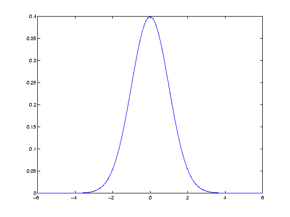
But how do we get these hot and cold colours around our points and make the heatmap look smooth and beautiful? Well, some of you may have heard of a thing called a Gaussian kernel. That’s just a fancy name for a particular type of curve. Let me show you a 2D image of one:
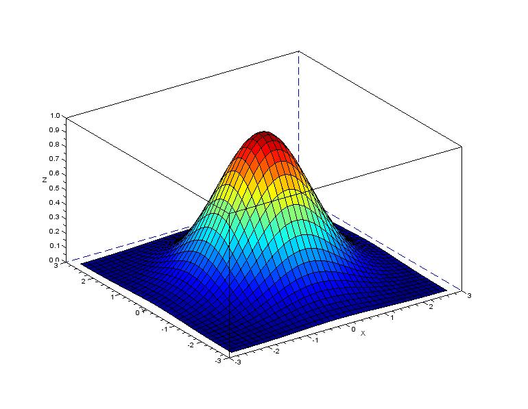
That curve can also be drawn in 3D, like so (notice the hot and cold colours here!):
Now, I’m not going to go into too much detail on Gaussian kernels because it would involve venturing into university mathematics. If you would like to read up on them, this pdf goes into a lot of explanatory detail and this page explains nicely why it is so commonly used in the trade. For this post, all you need to know is that it’s a specific type of curve.
With respect to our heatmaps, then, the idea is to place one of these Gaussian kernels at each coordinate location that we have in our “coords.txt” file. The trick here is to notice that when Gaussian kernels overlap, their values are added together (where the overlapping occurs). So, for example, with the 2D kernel image above, if we were to put another kernel at the exact same location, the peak of the kernel would reach 0.8 (0.4 + 0.4 = 0.8).
If you have clusters of points at a similar location, the Gaussian kernels at these locations would all push each other up.
The following image shows this idea well. There are 6 coordinates (the black marks on the x-axis) and a kernel placed at each of these (red dashed lines). The resulting curve is depicted in blue. The three congested kernels on the left push (by addition) the resulting curve up the highest.
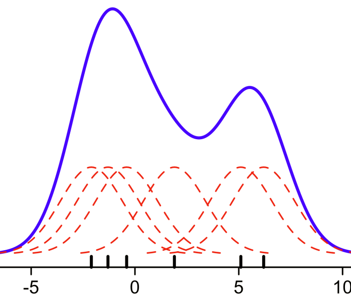
This final plot of Gaussian kernels is actually called a kernel density estimation (KDE). It’s just a fancy name for a concept that really, in it’s core, isn’t too hard to understand!
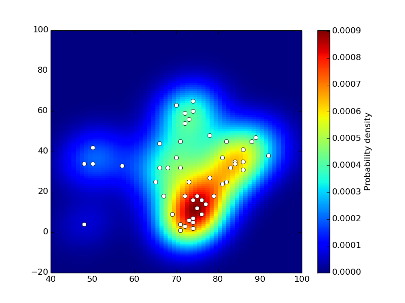
A kernel density estimation can be performed in 3D as well and this is exactly what can be done with the coordinates in your “coords.txt” file. Take a look at the 3D picture of a single Gaussian kernel above and picture looking down at that curve from above. You would be looking at a heatmap!
Here’s a top-down view example but with more kernels (at the locations of the white points). Notice the hot colours at the more congested locations. This is where the kernels have pushed the resulting KDE up the highest:
And that, ladies and gentlemen is how you create a heatmap from a file containing coordinate locations.
And what about some accompanying code? For the project that I worked on, I used the seaborn Python visualisation library. That library has a kernel density estimator function called kdeplot:
# import the required packages

import pandas as pd

import seaborn as sns

import numpy as np

from matplotlib import pyplot as plt
# Library versions used in this code:

# Python: 3.7.3

# Pandas: 1.3.5

# Numpy: 1.21.6

# Seaborn: 0.12.1

# Matplotlib: 3.5.3
# load the coordinates file into a dataframe

coords = pd.read_csv('coords2.txt')

# call the kernel density estimator function

ax = sns.kdeplot(data = coords, x="x_coords", y="y_coords", fill=True, thresh=0, levels=100, cmap="mako")

# the function has additional paramter, e.g. to change the colour palette,

# so if you need things customised, there are plenty of options
# plot your KDE

# once again, there are plenty of customisations available to you in pyplot

plt.show()
# save your KDE to disk

fig = ax.get_figure()

fig.savefig('kde.png', transparent=True, bbox_inches='tight', pad_inches=0)
It’s amazing what you can do with basic CCTV footage, computer vision, and a little bit of mathematical knowledge, isn’t it?
To be informed when new content like this is posted, subscribe to the mailing list (or subscribe to my YouTube channel!):


Hi Zig, what numpy and seaborn versions were used in your above code, I tried to run it but got the below errors.
My numpy version is 1.23.4, seaborn is 0.12.0
Could you please post an updated code version for the above latest libraries to make the heatmap working?
Error 1:
could not convert string ‘200,’ to int32 at row 0, column 1
This error happened at line:
x, y = np.loadtxt(‘coords.txt’, unpack=True)
To clear the error I changed the line to:
x, y = np.loadtxt(‘data/coords.txt’, delimiter=’,’, dtype=int, unpack=True)
Error 2 and 3:
kdeplot() takes from 0 to 1 positional arguments but 2 were given
Patch.set() got an unexpected keyword argument ‘cmap’
These errors happened at line:
ax = sns.kdeplot(x, y, cmap=”Blues”, shade=True, shade_lowest=False)
To clear the errors I changed the line to:
ax = sns.kdeplot((x, y), shade=True, shade_lowest=False)
Then the code run through without error, but the generated heatmap image is almost white without any meaningful heatmap info on it.
Hi John. Thanks for this. I wrote that code about 4 years ago so it’s not surprising that it is not working any more. I wouldn’t have a clue what the library versions were back then. I’ll try to look into this, though, over the next month because I would like this post to be up-to-date. Zig
hello author,
I want to generate ground truth for human pose detection. I can for keypoints whcih has single point x,y. but i want to generate also for body parts, like elispse shape between 2 points x1,y1,x2,y2.
can this method be used to generate body part heatmaps as follows,
https://github.com/hellojialee/Improved-Body-Parts/issues/44
thank you
I understand how to do the histogram. You have explained it very good. The heatmap you have given at the beginning. Is there any way that can be done via python ?? or any other languages? If so How ?
Are you referring to the heatmap on the wikipedia page? It’s just overlaying of images. You can do this in Python. Try adding an alpha channel to the heatmap image, making it a little transparent, and then superimposing the heatmap onto the image that you want to use. OpenCV will help you with this.
Thanks for your explanation on heatmaps
Glad I could help!
I’ve left a similar comment on the ‘Mapping Camera Coordinates to a 2D Floor Plan’ blog.
I have a good grasp of the concept after reading this blog. After compiling the code however, Im not clear as to what I need to do to see some of the expected results? I think I could do with some more instructions after copying the code here into a .py file and then running python3 file.py?
many thanks
Hi, I can’t get this code to work. Name Error ‘plt is not defined’ …
Hey, thanks for pointing that out. I’ve added in an extra import statement to the code above (
import matplotlib.pyplot as plt). That should fix the error. Unfortunately, I currently don’t have a programming environment set up to test the code, so please let me know if everything works fine or not. Cheers.Zig