In my last two posts (part 1 can be found here, part 2 can be found here) I’ve looked at computer vision and the fashion industry. I introduced the lucrative fashion industry and showed what Microsoft recently did in this field with computer vision. I also presented two papers from last year’s International Conference on Computer Vision (ICCV).
In this post, the final of the series, I would like to present to you two papers from last year’s ICCV workshop that was entirely devoted to fashion:
- “Dress like a Star: Retrieving Fashion Products from Videos” (N. Garcia and G. Vogiatzis, ICCV Workshop, 2017, 2293-2299) [source code]
- “Multi-Modal Embedding for Main Product Detection in Fashion” (Rubio, et al., ICCV Workshop, 2017, pp. 2236-2242) [source code]
Once again, I’ve provided links to the source code so that you can play around with the algorithms as you wish. Also, as in previous posts, I am going to provide you with just an overview of these publications. Most papers published at this level require a (very) strong academic background to fully grasp, so I don’t want to go into that much detail here.
Dress Like a Star
This paper is impressive because it was written by a PhD student from Birmingham in the UK. By publishing at the ICCV Workshop (I discussed in my previous post how important this conference is), Noa Garcia has pretty much guaranteed her PhD and quite possibly any future research positions. Congratulations to her! However, I do think they cheated a bit to get into this ICCV workshop, as I explain further down.
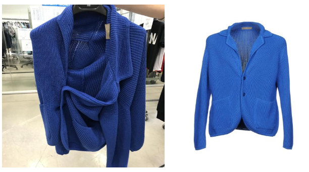
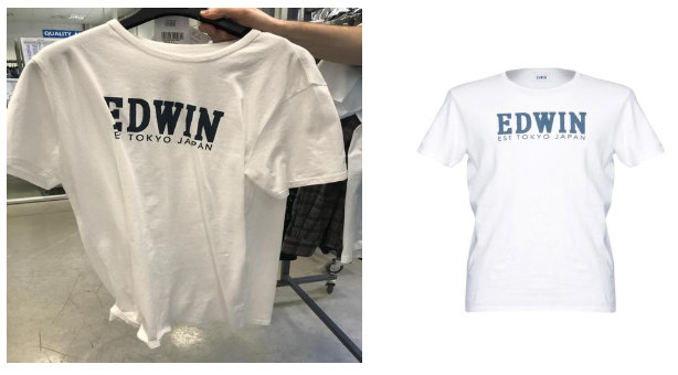
The idea behind the paper is to provide a way to retrieve clothing and fashion products from video content. Sometimes you may be watching a TV show, film or YouTube clip and think to yourself: “Oh, that shirt looks good on him/her. I wish I knew where to buy it.”
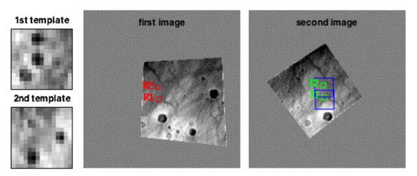
The proposed algorithm works by providing it a photo of a screen that is playing the video content, querying a database, and then returning matching clothing content in the frame, as shown in this example image:
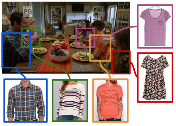
Quite a neat idea, wouldn’t you say?
The algorithm has three main modules: product indexing, training phase, and query phase.
The first two modules are performed offline (i.e. before the system is released for use). They require a database to be set up with video clips and another one with clothing articles. Then, the clothing items and video frames are matched to each other with some heavy computing (this is why it has be performed offline – there’s a lot of computation here that cannot be done in real time).
You may be thinking: but heck, how can you possibly store and analyse all video content with this algorithm!? Well, to save storage and computation space, each video is processed (offline) and divided into shots/scenes that are then summarised into a single vector containing features (features are small “interesting” or “stand-out” patches in images).
Hence, in the query phase, all you need to do is detect features in the provided photo, search for these features in the database (rather than the raw frames), locate the scene depicted in the photo in the video database, and then extract the clothing articles in the scene.
To evaluate this algorithm, the authors set up a system with 40 movies (80+ hours of video). They were able to retrieve the scene from a video depicted in a photo with an accuracy of 87%.
Unfortunately, in their experiments, they did not set up a fashion item database but left this part out as “future work”. That’s a little bit of a let down and I would call that “twisting the truth” in order to get into a fashion-dedicated workshop. But, as they state in the conclusion: “the encouraging experimental results shown here indicate that our method has the potential to index fashion products from thousands of movies with high accuracy”.
I’m still calling this cheating 🙂
Main Product Detection in Fashion
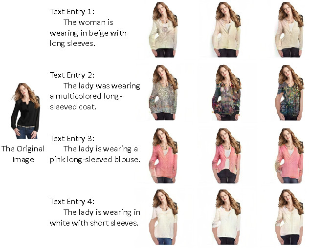
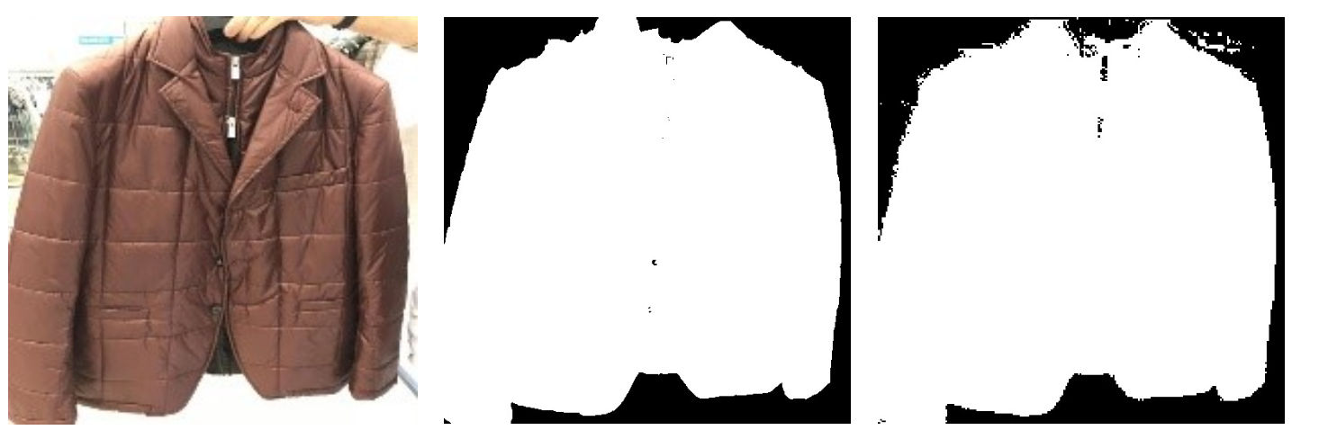
This paper discusses an algorithm to extract the main clothing product in an image according to any textual information associated with it – like in a fashion magazine, for example. The purpose of this algorithm is to extract these single articles of clothing to then be able to enhance other datasets that need to solely work with “clean” images. Such datasets would include ones used in fashion catalogue searches (e.g. as discussed in the first post in this series) or systems of “virtual fitting rooms” (e.g. as discussed in the second post in this series).
The algorithm works by utilising deep neural networks (DNNs). (Is that a surprise? There’s just no escaping deep learning nowadays, is there?) To cut a long story short, neural networks are trained to extract bounding boxes of fashion products that are then used to train other DNNs to match products with textual information.
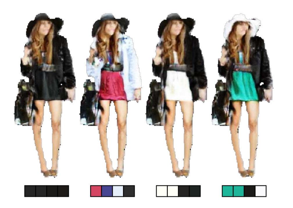
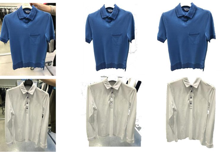
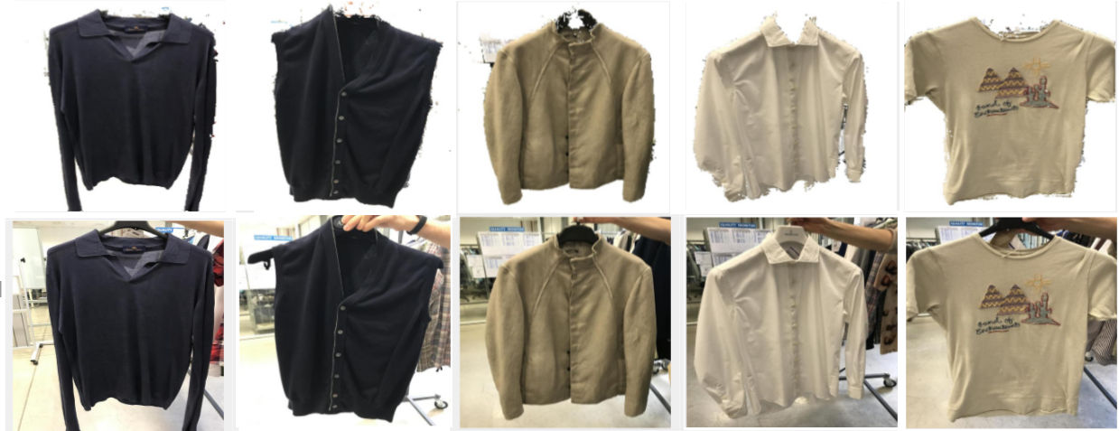
Example results from the algorithm are shown below.
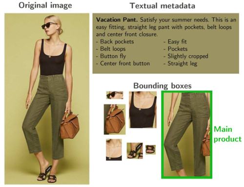
You can see above how the algorithm nicely finds all the articles of clothing (sunglasses, shirt, necklace, shoes, handbag) but only highlights the pants as the main product in the image according to the textual information associated with the picture.
Summary
In this post, the final of the series, I presented two papers from last year’s ICCV workshop that was entirely devoted to fashion. The first paper describes a way to retrieve clothing and fashion products from video content by providing it with a photo of a computer/TV screen. The second paper discusses an algorithm to extract the main clothing product in an image according to any textual information associated with it.
I always say that it’s interesting to follow the academic world because every so often what you see happening there ends up being brought into our everyday lives. Some of the ideas from the academic world I’ve looked at in this series leave a lot to be desired but that’s the way research is: one small step at a time.
(Part 1 of this series of posts can be found here, part 2 can be found here.)
—
To be informed when new content like this is posted, subscribe to the mailing list (or subscribe to my YouTube channel!):